Showing posts with label computer graphics. Show all posts

Tuesday, January 21, 2020

Digital Repeating Patterns


Here's a fun project my computer graphics students completed! I learned the basic steps from a Skillshare class that was hand drawn repeating patterns. I let the students start drawing by hand but we finished on the computer. Here is a link to the handout I gave them with all the steps: https://docs.google.com/document/d/1ChKRWFiFgo_rDOi1lhNMWZF8jWc1EAj8FEBXxgwHSIo/edit?usp=sharing 
 
I need to explore doing this project in Illustrator. I have only had access to an updated version of the software for about a year and am self taught so I'm not sure of the best way to do it, but I feel like it might work even better, or at least save some steps!
It was really fun to see what objects the students chose to work with.

I will admit that sometimes things don't match up perfectly when you repeat the tile, which doesn't make sense to me, but be prepared in case it happens. We were able to just make some small adjustments when zoomed in and complete a couple lines to fix things.

Wednesday, January 15, 2020

Photo Friday: #ThingsOrganizedNeatly


Have you ever looked at #ThingsOrganizedNeatly on instagram? It is what my students would call #satisfying.
It also became a Photo Friday challenge. Students could bring in objects or use what they found in the art room. Most just used tools or supplies found in the classroom.
Lots of brushes!

Vintage thread spools that I played with.
Letter magnets
Straws and popsicle sticks

Saturday, December 21, 2019

Photoshop Drawings Into Reality

If you're like me, you stop and look at EVERY picture in the collection when you see something like "Dad turns his 6-year old son's drawings into reality" pop up in your news feed. I started thinking that it could turn into an interesting assignment for my computer graphics class!
I started by asking the students to draw an animal from memory- NO LOOKING at a photograph. Next, I explained to the students that I wanted them to use Photoshop to make a picture of the real animal look like their drawing. 
Some needed to combine multiple parts of different photos to match their drawing and some were able to make changes with the liquify tool, clone stamp, or selecting and rearranging parts.
Here is my example including the (not very accurate) first drawing!
Some kept the background simple, some needed to replace it with a new photo to complete the scene.
I think this lesson will be a keeper for next year. It was fun for the students to do, they had to make appropriate choices from their arsenal of tools, and it only took a few class periods to complete.

Wednesday, July 31, 2019

Digital Paintings with ProCreate

In the last couple of years we were able to acquire some iPads and apple pencils for my art program. The first one was purchased with our Art Club account and the others were purchased with a grant. I currently have 3 that the students take turns using. ProCreate is one of our favorite apps. I've been trying to use it to create my own digital paintings so I understand it better and have examples to show the students. For about a month I completed a digital artwork for the IllustrationFriday.com prompt and I hope to do that again when school starts.
Here is a video of one of the first digital paintings I made. There is no sound but you can see a sped up version of the process I used.

Here are a few other illustrations I created.
I think this one was something fairytale-ish but I can't remember the exact word
flight
galaxy
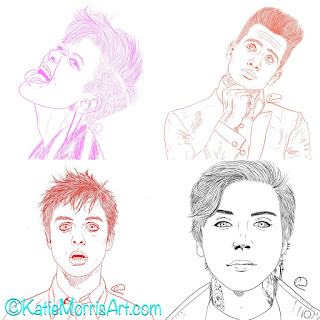
I encouraged students who wanted to learn to start by drawing on top of one of their photographs. Here is the process:
1. Line Drawing
-create a new canvas in ProCreate
-import photo and resize/arrange in place
-create a new layer on top of the photo
-under the "inking" brushes, select technical pen or studio pen
-change color to white or something that will show up on top of the photo
-"trace" the image, creating a line drawing with important shapes and details
2. Begin to paint
-create a layer BEHIND your line drawing and ON TOP OF the photo
-select a brush and a color that match your image and begin to paint in the shapes
-you can either start with a more textured brush or something simple like the round brush- it just depends on the look you want
-adjust the brush size to something appropriate for the shape
-turning the opacity down can yield a more "painterly" effect
3. Layers
-it's a good idea to make different layers for different sections of your painting
-every once in a while, turn off the photo layer by clicking the checkmark on the right side of the layer so you can see what you have really created
-you can make layers of solid color behind layers of texture
-layers can be used to adjust the look of colors like an underpainting
4. Blending
-you can use the tool that looks like a finger to smudge or blend colors
5. Brushes
-there are a variety of brushes in different categories for different textures and patterns
-you can use brushes to achieve realistic textures that match your picture or you can use them to create a more illustrated style
-brushes can be created for special effects
-to create a brush hit the plus sign at the top of the brushes panel
-import a photo that has the texture you want as the "grain source" and select a brush shape
-adjust the settings on the brush you created (or any brush by tapping on it twice) to get the look you want
6. Background
-make a layer behind the others you have painted and work on the background
-it can match your photo, just be colors and textures, or whatever style you want
-hide the photo to check and if it looks good, delete the photo layer by sliding right and hitting delete
7. Share/Export
-decide if you want to keep your sketch layer visible or not then you are done!
-go back to gallery
-select your image and hit the share button
-choose the file type you need to export as- jpeg works fine
-save image to camera roll, email, etc.
-we turn in through email or classroom once the image is added to photos


After students felt comfortable with a photo as a guide they got more creative, using a photo as a guide for one element or just drawing directly on a blank canvas in the app.


The students really enjoyed learning ProCreate. Some utilized it for their tool of choice in themed projects in my intro class and the computer graphics students were required to create one project using the app. Thankfully it was a small class so they just took turns and worked on an alternate project while waiting.

Monday, June 25, 2018

Movie Poster Design

Usually summer break is when I can get caught up on blog posts from the previous school year but this summer has been a little different! We recently moved to a new house in the country with a bigger lot that will allow for the creation of an even bigger butterfly garden, space to grow some vegetables, lots of room to play outside, AND it has a building that was previously a potter's studio! Eventually, when we get all the boxes unpacked, that space will become my studio and will have room to host workshops and teach classes. We just got internet hooked up a few days ago and on top of moving, remodeling, unpacking, etc., I'm due with our 3rd baby, like 2 days ago.

So, without further ado, here is a lesson that I've used the last 2 years in my high school computer graphics class. 2 years ago, I had a student enrolled in the class who was planning to major in film at university and would talk about the scripts he'd written. I started thinking about how cool it would be to make a life size movie poster for one of his films, as well as how many of our CTE competencies could be hit with a movie poster design project. Movie posters have emphasis and heirarchy, they give you hints at the story without giving away EVERYTHING, and they use color as a design element. 

I first asked students to come up with a movie concept- this could pretty much be anything appropriate for school. Some did parodies or mash ups, some did spin offs of series they enjoyed, and some made completely new ideas. The students filled out a simple google form with questions about genre, a short synopsis, etc. just to help them think it through.

After planning the idea, the students created thumbnail sketches to help plan the composition. They were supposed to create 3 sketches and get feedback from classmates on which was the most effective.

Next, we watched a short video on how color is an important storytelling element in films. The students were asked to choose a screenshot or poster from a movie, tv show, or video game in the same genre as the poster they were planning and sample the colors. I later showed how they could use the hue and saturation and color balance tools in photoshop to adjust the colors of the photos they were using.


The students then gathered images- either creating their own (preferred method) or using images labeled for reuse. We had digital cameras, scanners, graphics tablets, and our software available for use. The posters were designed to either 24x36 inches or 16x20 inches. Our school has a large poster printer so it was really fun to print the poster from the furture film-creator student at 24x36 inches and display it at League Art. He was a student who didnt' see himself as an artist so it's always extra fun to see a look of satisfaction on a "non-artist's" face when they are proud of their work.

 I recently posted the lesson plan with links to the plan document, rubric, etc. on the smARTteacher so feel free to head over there and check it out!

Monday, April 2, 2018

Digital Op Art

I can't believe I haven't posted this project before! I tried it for the first time with my Computer Graphics class this year and it was a keeper. We covered art history, graphic design, and practiced some new skills in photoshop.
When I show the first slide without the Op Art title, I ask the students if they know what that style of artwork is called or if it reminds them of anything to gauge their prior knowledge. We talk about the "mother" and "father" of Op Art and what we can learn to apply to graphic design.


Next, I demonstrate some techniques in photoshop that the students can try out but ultimately they choose what style of Op Art they want to use. We talk about color combinations, grid/ruler tools, gradient tools, distortion filters, etc.
The technique that the most students want to use is to put text into their Op Art. I recorded a quick video this afternoon of the steps we use. I obviously need to practice screen recording since I flubbed the beginning and end, but at least it will be handy to direct students to that video when they've forgotten a step!


Here are some of the student examples!

Wednesday, February 15, 2017

Digital Found Object Faces


Here's a fun lesson I did with my Computer Graphics class at the beginning of the semester. In first semester we focused on a lot of different tools in Photoshop but for this first project of the new semester I wanted students to practice different ways of obtaining images. This time they were not allowed to use any images they found online, but instead could use the scanner and digital camera.

The full lesson plan can be read here as a Google Doc and the Slides presentation I showed to kick it off can be viewed here. You can also "keep" the lesson and resources on the smARTteacher.

We looked at illustrations made by Hanoch Piven, one of my favorite illustrators, and watched a chunk of his TEDx Jerusalem talk. We discussed composition and how the objects he chooses to make the facial features of his subjects often relate to their personality or life. Here are the requirements and suggestions given to the class:

  • Create a self portrait using found objects for facial features. Consider using objects that represent you.
  • Pay close attention to the composition- how things are arranged. Not only should the objects be composed into a face, the whole portrait should fill the space of the page so that it is interesting and eye-catching. Will you use just head and shoulders or a big head on a little body?
  • Use a combination of techniques to digitize your objects- digital camera and/or scanner
  • You may paint the background of the head and digitally place the objects on top
  • Image size should be a minimum of 8x10 inches, 300 ppi

The students seemed to really enjoy this lesson so it will be brought back again next year. I had used Piven for inspiration at the elementary level but this was my first time introducing him to high schoolers. Click here for a mixed media Piven-inspired elementary lesson and here for a fun activity tub, the Piven box.

Thursday, June 9, 2016

Computer Graphics Gelli Stencils


One of the 12 Days of Photoshop challenges in my Computer Graphics Class first semester was to use Photoshop to create a stencil or a mask for use in gelli printing. I have a class set of student gelli plates that are 5x5 inches and brought mine from home in several different sizes.
Most students found they could do this without using photoshop so they just printed their designs and used a blade to cut out the space they didn't want.
The volleyball at the top was created with a mask and a stencil. The student used a mask to block out the circle and a stencil to create the lines on the volleyball.

I really like the painterly look of the Google monoprint.

The love the bird print. The circles in the background are the ghost print of a stencil. She placed the bird mask over the plate to pull this print.