Showing posts with label value. Show all posts

Sunday, June 18, 2017

Personal Pop Art

Jim Dine is an American artist who doesn't agree with the label of Pop Artist that is often used to describe him. While Dine uses simple, recognizable imagery in his work, the images are personal. Jim Dine is probably best known for his paintings of hearts but when I was researching him a while back I found some beautiful drawings of tools and fell in love with them! I love the mark making, the quality of the lines, and the range of values. 
I also like the reason Dine chose to come back to tools again and again- his family owned a hardware store when he was a child so he grew up around tools. (If you want to learn more about Jim Dine, the Art Story has a good resource.)
Here is the lesson plan I eventually came up with inspired by Jim Dine, which I posted on the smARTteacher
10 sessions; 45 minutes per session

1. SWBAT participate in a discussion about Jim Dine's work.
2. SWBAT brainstorm people who are important to them and objects that represent them.
3. SWBAT create a 6 step value scale using drawing pencils.
4. SWBAT identify the differences between different types of drawing pencils (ex: 2B, 4H).
5. SWBAT create a symbolic observational still life graphite drawing of an object that represents someone important in their life.
6. SWBAT utilize graphite drawing techniques to create value and contrast in their drawings.
7. SWBAT reflect on their work and self-assess using a rubric and artist statement.

1. Paper (white drawing paper or I've used colored construction paper for upper elementary)
2. Variety of drawing pencils
3. Erasers
4. Objects to observe (students bring from home or find in the classroom)
Optional
5. Other black and white media such as charcoal, colored pencils, etc.

Need these materials? Visit Blick!

Day 1
1. Introduction
-Lead presentation about Jim Dine's work and discuss with students
-Explain that he was identified as a pop artist but doesn't totally fit the bill since his work is more personal and about creating meaning
2. Brainstorm
-Students brainstorm at least 2-3 people important in their life
-Students brainstorm objects that could represent those people. Suggest thinking about the connection between them- what do they do together, what's special about them, why are they important to you, what do they enjoy, etc.
Day 2
3. Drawing from observation
-After students bring their objects from home they will create a line drawing from observation.
-Remind students to spend at least as much time looking at the object as they do looking at their drawings
-Draw light until you know it's right

Day 3
4. Creating value
-Talk about value creating contrast in drawings
-Demonstrate and then students create a 6 step value scale using a soft pencil and a harder pencil
-Review the differences between B and H pencils
-Practice blending and remind students to follow the contours when they shade.
5. Students begin to add value to their drawings after the line drawing is complete

Days 4-9
6. Students continue to work on drawings. The teacher provides assistance and feedback.

Day 10
7. When drawings are finished students will self assess with a rubric and write an artist statement about the work and the significance


I have taught this lesson to 5th and 8th graders, but I also think it would work well with high school. Last year I did it toward the beginning of the semester for 8th graders to give them kind of a warm up for observational drawing, practice shading, and to help them start thinking about the reasons artists choose their subject matter.
 This student made her drawing kind of a compilation of objects within the theme. She even brought in a real saddle to draw from! We didn't think she'd be allowed to bring in one of her horses so we went with a toy. :)

These two students made drawings that represented their fathers.

I only have a few photos of student work because I had a tiny class of only 6 8th graders last year. I am planning on doing it again next year and I hope it goes just as well.

Sunday, October 4, 2015

Artists Observe

One of the first assignments for the year after reviewing the Elements of Art, was to spend some time practicing observation with 8th grade and high school graphics students. Students chose from any of the still life objects I brought from home or anything they could find or set up in the classroom. We probably spent about a week on these drawings starting with a contour drawing and then developing value through shading with pencil. This straight forward real life drawing helped me to gauge the students' observational skills, drawing abilities, and persistence. Allowing the students to choose WHAT they wanted to observe (real objects for this project, not photos) helped some be more engaged and was very practical as my classroom does not have a good set up for a central still life that all could observe.
An old cowboy boot was one of the most popular items to draw. It was set up in the middle of a crowded 8th grade table so it was drawn from many angles.
The lines may have been a bit warped on the tin can above, but I was impressed with the shading.
We had live models for part of the project- black swallowtail caterpillars!
Two students drew a stuffed animal Cat in the Hat.

Some dried starfish were great for practicing texture.
A few students set up blocks to draw.

Glass jars are always a challenge. A thermos from my collection was shaded with cross hatching.
Art tools and supplies can make good models for observation.
Another popular model was a deer skull I borrowed from a friend. There are a lot of challenges involved but students handled it pretty well.

What is your favorite way to handle still lifes?

Saturday, August 18, 2012

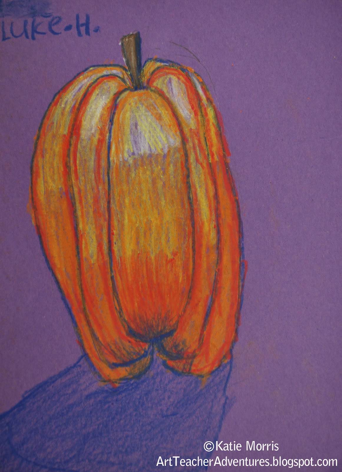
2nd Grade Value Pumpkins

 Last year one of my goals was to really work on achieving a bigger value range with students, starting with 2nd grade. This 2nd grade lesson was definitely more skills-based than creativity-based. The students each drew a pumpkin then followed along as I showed how to use a variety of colors to achieve value.  It was great to see the students concentrating on adding more value on their own in subsequent art projects.
To add color, we worked light to dark starting with white crayon at the top of each section, and working downward, blending each successive color- white, yellow, yellow-orange, orange, pink-orange (there's no "red" in construction paper crayons for some reason.) It is important to color in each section separately and NOT across all at the same time. After the first layer, we went back and added more white at the top following the curve of each section, then blue at the bottom, following the curves up. Next, we added a shadow below the pumpkin. Students who had time were able to add any details they wanted to the background but for some reason I don't have many photos of pumpkins with backgrounds. You'll just have to use your imagination. :)
We used construction paper crayons on purple paper. I'm sure if we had used oil pastels, we would have been able to blend the colors more, but the few times I've used oil pastels with my students, EVERYTHING just ends up dirty. I'm not just talking about messy hands and tables, those I can handle. The oil pastels and the artwork just looks dirty when the little bits of other colors get mixed in. Still, I should probably give oil pastels another shot.

Sunday, July 22, 2012

1st Grade "Value" Money Lesson


Last fall when our district Art department was learning about African cultures, a middle school teacher who had visited South Africa spoke to us about her trip. She shared a lot of interesting/inspiring information, but what stuck out most to me to inspire an Art lesson was a comment she made about their money. She showed a photo of bills from South Africa and said (I'm paraphrasing here) "We have dead presidents (and Ben Franklin) on our money, they put animals because that's what is valued." The idea of money not just being valued, but showing what is valued stuck with me. 
We spent time looking at money- REAL money when I passed out $1 bills for observation and images of currency from the US and other countries. We watched a video about how US bills are designed and printed (careers in Art, people!), compared US bills to South African bills, and came up with features that are common in most printed money before the students designed their own bills showcasing what they value
I've decided to embed the complete lesson and post some of the resources we used below, as well as student work.

Currency of the world
Via
Source: google.com via Katie on Pinterest


The video above is Field Trip to the Money Factory- it was created by Kids.gov and shows interviews with a banknote designer (talks about symbolism) and a script engraver.
These were the required elements of the students' designs.
I think if I teach this again, I may try using colored permanent markers for the details instead of crayon. A lot of the first graders struggled with wax-resist. Some didn't press hard enough with the crayon and some scrubbed when painting and practically dissolved their paper. They were very proud of their money and couldn't wait to take them home to show their parents. I would also like to try this with older students sometime. I bet 5th and 6th graders could make some awesome designs.
I let the students pick whatever amount they wanted their bill to be worth. If I had realized sooner that 1st grade works on number recognition to 100, I would have asked that they choose a number 1-100 to integrate some of their math curriculum.

Friday, May 18, 2012

Sports Spheres

 I've been trying to teach my students the difference between shapes and forms. I knew I wanted to do a lesson with 5th grade focused on the illusion of form through creating value and when I found out that our Family Fun Night (an event that bring several hundred students and their families to the building) theme would be "Sportacular", I decided to use the spheres found in sports as inspiration. Really, it makes sense. Balls are something tangible that the students are very familiar with, and sports are very motivating. (*By the way, try not to say the word "balls" if you can avoid it. It often leads to wild giggles.) I did tell the students if they didn't want to paint a ball, they could think of another spherical object to paint.

I borrowed a variety of balls from our PE teacher so the students would have a real object to look at. To introduce the assignment, I grabbed the real basketball, a painting I made of a basketball, and I made a quick line contour drawing of a basketball on the whiteboard. The students discussed how they were alike and different then I showed how 3D objects, objects with FORM, have highlights and shadows, and that adding highlights and shadows (VALUE) to paintings can create the illusion of form. I finally remembered to bring a flashlight to school which helped illustrate the concept of highlights. Regular fluorescent lighting is not directional so it can be hard for students to see. 

I demonstrated painting a sphere. I recommended that the students paint a base color first, followed by adding the highlight, then add the shadow last and blend, blend, blend. The students used a compass to draw a circle on a 9x12 inch piece of paper then chose their paint colors. The balls did not have to be painted in traditional colors. For white spheres, I suggested choosing a color instead of black for the shadow. After the base of the sphere was painted, the students added the identifying lines. 

In the second class period, the students added the remaining details then cut out their balls. Because I knew I would be asked a hundred times how to draw the lines and I didn't have enough balls for everyone, I made up some reference pages that showed the steps for drawing a basketball, baseball/softball, volleyball, and how a tennis ball would look from different views. Only a few students attempted soccer balls and I showed them the "how to draw a soccer ball" page here because I honestly wasn't sure how the pentagons and hexagons fit together before. If I teach this same lesson again, I will not recommend golfballs. A couple students attempted, but there were too darn many dimples and it just didn't work out well. Most students drew in pencil first then used a thin brush to paint the lines and a few used sharpies. I hoped that all would have time to use the thin paintbrush because I thought it would be good to practice brush control.

Some of the artwork went on my bulletin board and the rest of the balls were taped along the hallway walls to look like they were bouncing. After this project I found out that some of my 5th graders need more practice with their cutting skills! Or maybe it was an issue of patience. Either way, some students did a really nice job painting then cut it out so sloppily that it didn't even look like a circle anymore.


 I definitely wanted to use the bulletin board to drive home the main points with students and show everyone that we didn't just make decorations.
 My favorite part is below. I labeled 2D examples with "this is a shape"and "this is the illusion of form" then painted a styrofoam ball the same color to hang from the ceiling with a label that says "this is an actual form".


Sunday, February 26, 2012

6th Grade Sumi-e

I was really looking forward to ink working on sumi-e* with my 6th grade students. I made a big deal about ordering the special brushes and real rice paper and sumi ink because I was trusting them to try really hard. This was difficult for most students but I was just as frustrated by the lack of effort from some, as they were by learning a new media. I allowed one class period to practice using the brushes with diluted black tempera paint on regular paper and one class to use the "real" supplies and paint Kansas landscapes. I wanted the students to create landscapes from their place in the style of another place to make it really multi-cultural. 
*In case you were wondering (I had to look it up,) "sumi" is the Japanese word for ink and "sumi-e" means ink painting.

"Practice" painting from the 1st class. I like these better than the landscapes!
The frustration had 2 causes. First, it was hard for the students to translate a photograph into the simpler style we saw in traditional sumi-e. I don't mean "simple" as in easy. I think it is hard to understand how a "simple" style and composition can be harder to plan. You have to get just the right balance. This part was my fault. I demonstrated using the brush and showed some videos from YouTube, but I didn't want to over-demonstrate and have all the paintings look the same. Maybe the students could have used more instruction.
The second cause was that my supply order didn't show up in time so they had to practice with tempera instead of ink. It was really hard for the students to achieve a value range with the real ink so after the first two classes, we switched back to black tempera.

Even though it was hard, and I admitted that I was learning too, most of the students did make an honest effort. Some, did not. I was tempted to bust out a "no-no" board when I saw giant suns and loopy flowers showing up because it translated as a lack of sincere effort. We stopped and talked about effort, craftsmanship, attitude, etc. The paintings I've included here were all by students who were really trying. 

This painting was a major accomplishment! This was the only student to reference the little waterfall photo who actually used directional lines to differentiate between the rocks and the water while still showing texture.

So now I have lots of supplies leftover but I'm hesitant to try sumi-e again anytime soon. I think we'll paint with the ink on top of water and pull prints. I know there is a term for this besides marbling, I just can't remember what it is!