Showing posts with label negative space. Show all posts

Sunday, August 5, 2012

3rd Grade Fall Project- Warm Weaving/Cool Leaf Printing

It took me so long to get all my fall lessons photographed last year that I just decide to save them up to post closer to the correct season. It's still technically summer while I'm typing this, but
  1. I start back to school in 2 days.
  2. The drought is making the leaves turn brown and fall to the ground so it looks a little bit like fall today.
  3. I'm already thinking about lessons for the fall semester and you might be, too!

Back in my very first year of teaching (3 whole years ago seems like a long time now) I had planned a very similar lesson for 2nd grade but it took so long to weave, and I had a disastrous experience trying to print leaves with another grade, that it just stayed a weaving. I decided to be brave and try it with 3rd grade last year. We reviewed warm and cool colors (I tend to incorporate a lot of color theory) and the students identified warm colors as "fall colors". I explained that the students would be weaving using warm colored construction paper then printing leaves on top using cool colors. All except for a couple new students had learned to weave in Art class the year before so they didn't need much review aside from how to hold the folded paper to cut the warp and I had my early finishers help students who were struggling. I'm pretty sure we did this in one class period since I let the students choose from 6x9 inch construction paper instead of a full 9x12 inch sheet. After the strips were woven as tightly as we could get them, students with extra time added glue to the loose ends for extra security.
After the weaving was complete, I passed out trays to each table with green, blue, and purple tempera paint and 2 brushes for each color. We didn't want to make a mess on the tables, so I passed out some odd sized paper scraps for the students to brush on top of. It didn't take long for us to realize that the negative space of the leaf had possibility so we reviewed positive and negative space and turned this into a 2 part project! The students tried to make a nice composition with their overlapping negative space leaves as well as printing on their weavings.

Sunday, March 18, 2012

State "Space" Symbol Drawings

 There were lots of "S" words involved in this 2nd grade lesson. The Shape of our State was used as the base. The students learned about Space (not outer) and chose to draw at least 5 Kansas Symbols in either the positive or negative space.
One Kansas Farmer: A Kansas Number Book (Count Your Way Across the USA) (Discover America State by State)
In the 1st class period, we read part of One Kansas Farmer, focusing on the symbols for our state like the Sunflower, Cottonwood Tree, Ornate Box Turtle, Meadowlark, Buffalo, Tiger Salamander, and the Honey Bee. We talked about how other things not in the book could be symbols like our capital building and wheat. 
We hadn't talked much about "Space" before so I introduced positive and negative space. I like to stand like a statue with my hand on my head so I can point out that the statue (my body) is positive space and the space around me, as well as the "hole" between my arm and my body are negative space. I showed a piece of paper with the shape of the state of Kansas printed on it and the students identified the shape as positive space and the empty border as negative.

I told the students they would be choosing positive or negative to work in and showed examples of filling the chosen space with symbols. I had lots of pictures printed off for the students to reference at each table. They all "got" the positive/negative space idea, the only challenge was getting them to fill the space. We all know it's tricky to get students to draw big- some would draw their 5 symbols then tell me they were done even though they needed to add more to fill in the gaps.

In the 2nd class, the students used Color Sticks and colored pencils to fill in their drawings. I think that I added a 3rd class period for some classes when the schedule allowed it. When the students finished coloring, they cut out their drawings and glued to a bigger piece of paper. The drawings were started on copy paper so I could reproduce the shape of the state so this step added some stability. I did not tell the students their states needed to face the proper direction, mostly because I didn't think about it in time. Some put their states the "right" way, some just turned the shapes however they wanted.


 Students who finished early wrote artist statements about their work before moving on to free draw. One of the 2nd graders told her teacher this was "The BEST Art project ever!" Kids are so easy to please. :)

Saturday, December 10, 2011

Visual Poetry inspired by Austin Kleon

I first learned about Austin Kleon when his "Steal Like An Artist" essay was being posted all over the place last spring. (By the way, the book version is coming out in the spring.) I explored the website of the "writer who draws" and saw his newspaper blackouts, like the one below, Overheard on the Titanic, which are super cool!
Source: 20x200.com via Katie on Pinterest

Kleon makes poetry by starting with a newspaper and blacking out the words he doesn't need to make a new meaning.

I decided it would be fun to try the technique with my 6th grade students. Because I wanted to make it a one class period project, I chose about 20 newspaper articles/horoscopes/editorials with interesting words and photocopied them. Part of me wanted to just give the students a newspaper but I knew I would end up with students who had not chosen an article to work on by the end of class. I suggested that the students scan the article for words that jumped out at them and underline those words with pencil. That way they could see their choices and construct their phrase or sentence while still being able to fix mistakes. Next, they were supposed to draw a box around the words with sharpie and black out the words they didn't need anymore. By drawing the box first, the students were less likely to get in a hurry and black out an important word. Quite a few are pretty hard to read because they still got too close to the words. If you do this with your students, make sure to remind them to leave as much space around the word as they can. I didn't say that had to, but most of the students checked with me before starting with sharpie. I was able to give some advice, like to make it shorter, or construct a new meaning because some were basically summarizing the article. Another thing the students have to think about is how to direct the viewer/reader's eye. If the article has columns based on how they use the sharpie, the students can make you read left to right or down each column.
 Before I presented the lesson to the next group of students, I found one of Kleon's newer blackouts that makes a subtle picture with the negative space. I encouraged the students to think more about the negative space and the overall design. I'll admit that a few students were a little confused as to why we were doing this in Art class. I told them that it was part poetry and part visual art because of how they created the design with sharpie.


You all know how I love bulletin boards. I was ready to switch out my design and thought this would be a good opportunity to explain what the artwork was all about. Plus, I was excited to use the old joke. I covered the background in newspaper first. I don't have many borders so I put out an email to see if I could borrow a red border from anyone. I got some offers but the reds were all more red-orange, not what I had pictures. So, I decided to just dry brush a red tempera paint border on. Then I used some of the leftover red paint to make a frame around the explanation. I had die-cut letters for "What's black and white and 'read' all over?" and glued them to black construction paper so I can reuse the title some day and not have to worry about keeping all the letters together. I filled in the extra space with some student work. Also, I was relieved to find out that most of the students still know this joke! Or at least some silly version of it.

Thursday, July 14, 2011

1st Grade Mobile Marker Drawings


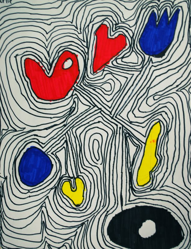
I used Calder.org to introduce my first grade students to Alexander Calder's artwork, focusing on his mobiles.  The website is so comprehensive that I just used it instead of making a PowerPoint.  We mainly focused on the shapes he used during our discussion.  I drew examples of different shapes he used on the chalkboard for reference.  For the studio portion, I first asked students to draw 5-7 shapes that look like the kind of shapes Calder would have used.  (I try to teach the students the difference between being inspired by something and copying something.)  We talked aboout negative space and I asked them to put a "hole" in one of their shapes.  After the shapes were drawn, I showed them how to connect the shapes with lines.  *I recommended that they not form a ring by connecting the shapes in a circle.  I checked the drawings at that point to make sure there were no floating shapes and that they had drawn big enough.  When they were ready, I gave each student a sharpie to trace over their pencil lines.


Last year at this point in the project, the students painted with primary colored tempera paint.  This year we still reviewed primary colors but we tried out our brand new Mr.Sketch markers! (One thing I'm glad I ordered.)  I showed the students how the markers have a square tip and you can make wide strokes like you are painting a wall for the big part of the shape and just use the pointy tip for really skinny areas.  I'm thinking this will make the markers last longer since it reminded the students not to layer and layer and layer the ink.  I was very impressed with the quality of the markers.  Anywho...


After the shapes were filled in, I showed the students how to trace around the larger shape created by the smaller shapes.  We compared  it to ripples or concentric circles.  The students kept "echoing"the shape, leaving a small gap, until all the space was filled in.  They worked from the middle > out, then outside > in to fill in for any closed off spaces.  I think the lines made much more interesting visuals this year and the students were so proud when they finished!  This was actually a very calming process so that was a bonus!

Friday, May 27, 2011

Splashes of Color- My Examples


My examples show two different approaches to this project, you can read more about it by checking out the previous post: Splashes of Color.

Sunday, May 22, 2011

Splashes of Color


The SCED class at my 4-6th grade school comes to Art separately.  I really enjoy it because there are only 6-8 students so we have the freedom to try some things that might not work as well with a full-size class.

I ordered some droppers for watered down paint last fall and wanted to try them out.  I have 6 tables in the Art room at that school so I put one color of watered down paint at each table (red, orange, yellow, green, blue, violet).  I put one student at each table and gave them a straw and a 12x18 inch piece of white paper.  I allowed a few minutes at each table for the students to drop paint on their paper and blow it around with the straw.  I showed the students before they started that they can get different results by how they blow the paint around through the straw.  

Both in this class and in 1st grade when we blew branches for the bird nest lesson, I had to teach students how to just blow air through a straw.  Some had a hard time not spitting through it (gross.)  Guess they never learned how to blow bubbles in their drinks!

After a couple minutes, I had the students take their papers and straws and rotate to another table until they had had a chance to use each color.  Even though I KNOW we have talked about color theory a lot, I still had students who were so excited to discover what happens when paint colors mix!  I tried to stay out of what they were saying until I heard something like "yellow and green make orange!" when I felt I had to step in and point out that lots of colors had just gotten mixed together to create that color.  I think I might try this project again some time and only put out the primary colors.


On the 2nd and 3rd days, I told the students we were going to experiment with adding ink to the paintings.  I had tried out two different approaches on my test.  First, I tried using a skinny sharpie to trace around every little change in color and value.  Next, I tried using the sharpie to trace around the negative space.  I liked the results from both approaches so I showed the students both and they picked one or tried a mixture.  By the third class (2nd with ink,) some of the students were ready to quite even though they weren't finished but boy, some could have worked on it all semester!


This student asked if he could cut it out- I said sure, let's try it!