Showing posts with label shading. Show all posts

Sunday, June 18, 2017

Personal Pop Art

Jim Dine is an American artist who doesn't agree with the label of Pop Artist that is often used to describe him. While Dine uses simple, recognizable imagery in his work, the images are personal. Jim Dine is probably best known for his paintings of hearts but when I was researching him a while back I found some beautiful drawings of tools and fell in love with them! I love the mark making, the quality of the lines, and the range of values. 
I also like the reason Dine chose to come back to tools again and again- his family owned a hardware store when he was a child so he grew up around tools. (If you want to learn more about Jim Dine, the Art Story has a good resource.)
Here is the lesson plan I eventually came up with inspired by Jim Dine, which I posted on the smARTteacher. 
10 sessions; 45 minutes per session

1. SWBAT participate in a discussion about Jim Dine's work.
2. SWBAT brainstorm people who are important to them and objects that represent them.
3. SWBAT create a 6 step value scale using drawing pencils.
4. SWBAT identify the differences between different types of drawing pencils (ex: 2B, 4H).
5. SWBAT create a symbolic observational still life graphite drawing of an object that represents someone important in their life.
6. SWBAT utilize graphite drawing techniques to create value and contrast in their drawings.
7. SWBAT reflect on their work and self-assess using a rubric and artist statement.

1. Paper (white drawing paper or I've used colored construction paper for upper elementary)
2. Variety of drawing pencils
3. Erasers
4. Objects to observe (students bring from home or find in the classroom)
Optional
5. Other black and white media such as charcoal, colored pencils, etc.

Need these materials? Visit Blick!

Day 1
1. Introduction
-Lead presentation about Jim Dine's work and discuss with students
-Explain that he was identified as a pop artist but doesn't totally fit the bill since his work is more personal and about creating meaning
2. Brainstorm
-Students brainstorm at least 2-3 people important in their life
-Students brainstorm objects that could represent those people. Suggest thinking about the connection between them- what do they do together, what's special about them, why are they important to you, what do they enjoy, etc.
Day 2
3. Drawing from observation
-After students bring their objects from home they will create a line drawing from observation.
-Remind students to spend at least as much time looking at the object as they do looking at their drawings
-Draw light until you know it's right

Day 3
4. Creating value
-Talk about value creating contrast in drawings
-Demonstrate and then students create a 6 step value scale using a soft pencil and a harder pencil
-Review the differences between B and H pencils
-Practice blending and remind students to follow the contours when they shade.
5. Students begin to add value to their drawings after the line drawing is complete

Days 4-9
6. Students continue to work on drawings. The teacher provides assistance and feedback.

Day 10
7. When drawings are finished students will self assess with a rubric and write an artist statement about the work and the significance


I have taught this lesson to 5th and 8th graders, but I also think it would work well with high school. Last year I did it toward the beginning of the semester for 8th graders to give them kind of a warm up for observational drawing, practice shading, and to help them start thinking about the reasons artists choose their subject matter.
 This student made her drawing kind of a compilation of objects within the theme. She even brought in a real saddle to draw from! We didn't think she'd be allowed to bring in one of her horses so we went with a toy. :)

These two students made drawings that represented their fathers.

I only have a few photos of student work because I had a tiny class of only 6 8th graders last year. I am planning on doing it again next year and I hope it goes just as well.

Monday, January 9, 2012

2nd and 3rd Grade Snowpeople

Here are a couple snowpeople projects my 2nd and 3rd grade students completed in December. I have to say snow"people" because you know, it's an inclusive term and doesn't leave out the lovely snowladies.

2nd grade students learned how to overlap circles and create the look of spheres by adding VALUE with oil pastels. We've been on a value/shading kick in 2nd grade. My Tuesday classes who had an extra day practiced drawing and shading spheres in graphite in the first class then finished drawing their snowpeople scenes in the second class. Some still don't quite get that the shadows would always be on the same side but at least they are starting to understand shading. I'm hoping it will help when they start working on their duck stamp drawings in a few weeks. I left this lesson last year when I was on maternity leave and I think it went pretty well this year. I wasn't super excited about it, probably because it's a lesson you see all the time, but I suppose there's a reason it's tried and true! One little boy put his snowman in a leather jacket, which was super cute, but then he colored his sky in black behind it and it sort of disappeared. We're working on contrast...


 I had intended for 3rd graders to make snowpeople prints. but we made some changes.. 
I demonstrated overlapping the circles to make them look like stacked spheres on a snowperson, both as if you were looking straight at it and as if you were looking up to give them more options, then reviewed horizon lines. The students had a lot of freedom- their only requirements were to make a snowperson with overlapping and a horizon line. Any other features and details were up to them. They drew on these dense fiber board things, I really have no idea what they were used for but they are awesome, then traced with glue. *Of course when you trace a drawing with glue, you have to remind the students not to draw anything too small and to leave space between things so the glue lines don't run together or turn into big blobs. This started as another lesson I left during maternity leave.
 Last year the students used rainbow crayons made from recycled crayon stubs to rub over paper and make their drawings show through. I thought it would work to print the glue lines but when I tested mine, the glue was so bumpy that it was hard to make out the picture. I knew the students' lines were even bumpier so we changed the plan. I used it as an opportunity to talk to the students about problem solving and things not always going how we plan. I wanted to show them that even though my first idea didn't work very well, I didn't give up, just came up with something that would work better.
I haven't decided if covering the tables with vinyl cloths save time or not when cleaning up from painting...
In the second class period, I gave each table the primary colors, white, and just a tiny bit of black tempera paint to use. *It's amazing how many students will tell me I forgot green paint, for example, immediately after we review mixing primary colors to make the other colors they need! I showed them how they could use blue to add some shading (VALUE!) to their snowpeople. They were excited about making tints just like in their Polar Bear paintings. I gave them two brush sizes to use and suggested that they use the tiny brush to paint over the glue outlines of really important things. I actually don't mind the effect of the super-cheap-tempera-paint-I-wish-I-wouldn't-have-ordered here. It acted as almost a glaze and looked pretty cool with the glue showing through for snowflakes.
No fashionable snowlady would be seen in public without her makeup and best jewelry.
Students who missed the glue day drew with crayon then painted.


Tuesday, November 29, 2011

3rd Grade Polar Bear in a Snowstorm

I thought I'd give you all a break from my African Art lessons and show you something different that we just finished last week.

I remember when I was in grade school, somebody would hold up a blank piece of paper and exclaim that it was a "polar bear in a snowstorm".  I always thought it would be fun to really make a picture of a polar bear in a snowstorm.


This was a two class period project. First, we talked a little about idioms and the polar bear in a snowstorm saying. Then I used a paint chip to introduce "value" to the students as an Element of Art. I demonstrated painting blue at the top of their paper, white at the bottom, and gradually blending the two to make a tint of blue in the middle. This was really good practice for the students and something they had never really tried before. Most were able to get a pretty smooth transition and while some ended up with stripes, they still created new values. I used blue construction paper for the background so we could use up some of my not-so-high-quality tempera paint and not have to use 5 coats. At the end of the first class, I passed out 9x6 inch white drawing paper and the students started drawing polar bears. I printed off some photos for them to reference and offered to demonstrate drawing a polar bear so the students could follow along if they wanted. Usually when students draw along with me, they are more confident because they can see how I approach drawing. This time it backfired! The students kind of freaked out about it (for lack of a better term). Needless to say, after the first day I didn't demo and just told students to do their best looking at the pictures.

In the second class period, the students finished drawing the outline of their polar bears then I demonstrated using blue construction paper crayons to add some shadows to the bear's body. The students cut and glued their polar bears to the background then added shadows on top of the snow. The last step was to add flecks of white paint to make the snow storm. In the first class we tried using toothbrushes to flick the paint and that didn't work very well. Tuesday rolled around and my new plan was to water down the paint and put it in a spray bottle. As long as the students didn't go crazy squirting a bunch of times without looking, it worked well. I also think it could be fun to use the spray bottle for some Abstract Expressionistic paintings some day. 

I hope you'll check out some more examples below. It was pretty entertaining to hear the students make up stories about their artwork and see the different bears.

This was created in one class since the student was sick on the first day. Just gave the blue paper and a white crayon to create value in the background then everything else was the same.

Some students drew quickly and used their scraps to create large polar bear families...
Some got in a hurry to make lots of polar bears and just cut out bubbles...

 Some polar bears were feeling a little blue...
 Some made bears that were really looooooong...
 Some polar bears were leaping so fast that their shadows could not keep up...
 And some had really tall shadows!

We all enjoyed this project (especially making the storm) and as I was hanging the paintings this afternoon, I was already hearing positive comments! The end.

Monday, August 1, 2011

5th Grade Personal Pop Art

Popcorn for his mom.
When I was researching Jim Dine for my Kindergarten Hearts lesson, I became much more interested in his drawings of tools.  I love how Dine uses value and texture and how his artwork has personal meaning.  I filed the idea away and saved it for the end of the year with my 5th grade students.  I think this project had a lot of strong points but of course I learned things that would make it work better in the future.

Glasses/Goggles for her grandma.
On the first day, I started with a PowerPoint about Jim Dine.  The students were somewhat familiar with Pop Art since they made food sculptures last fall but I pointed out that Dine was different than most Pop Artists because he had personal reasons for choosing the objects he represented.  I deemed it Personal Pop Art.  I passed out half-sheet planning forms to help the students plan for the project.  

Click on the photo to see a larger version.
The students were supposed to think of 3 people who are really important in their lives.  *I did not allow students to use a heart symbol.* I suggested leaning towards family members or role models (someone they look up to and have a real relationship with) instead of friends.  I just had this fear of students choosing a friend and then destroying their artwork if they had a fight with that friend or something silly like that.  This was my favorite part of this project, seeing the relationships.  For each of the people the students wrote down, they were supposed to brainstorm possible objects they could use as symbols for that person.  I suggested an object that was small enough to hold in their hands.  The tricky part for some was coming up with an "object" for a symbol.  For example, some students wrote down an activity like "dance" or "fishing" so I helped them come up with objects as symbols for those things.  I briefly conferenced with each student to help them choose the best symbol and it was really cool to hear them talk about the who, what, and why.

The rest of the class was spent making a line drawing of their object on construction paper.  I let them choose any color they wanted besides black and white since I explained we would ONLY be using black and white media to add value and texture to the drawings in the second class.  The students had to think about what they wanted the final project to look like and consider that when choosing a color.  I told them if they wanted a color besides black and white, that is the color of paper they should choose.

Fishing pole for his grandpa.
During the second class, the students added value to their objects.  This is where it would have been REALLY handy to have the actual object for the students to look at.  We were able to find a few things around the Art room to use (a CD, a book, a fake banana, etc.) but most just had to make it up or look at a picture I pulled up on the computer.  This project showed me that I really need to focus more on value with the students.  I realized that when I talked about shading before with them, it was in color.  That knowledge doesn't always translate to black and white.  After value was added to the objects, the students experimented with expressive mark making to add texture similar to Jim Dine's drawings.  I pulled out just about all the black and white media I could find.  I found sharpies, crayons, graphite sticks, and also watered down black paint so it could be used for splatters.  Experimenting and using lots of media/techniques was encouraged.

Check out some of my favorite examples below and view our exhibit on Artsonia!

Crappie for her grandpa.
Hockey stick for a RoadRunners player who he looks up to.
A bobber for a grandpa that likes to fish.
This student combined his three different ideas for his mom: a shield, a paintbrush, and a cross.
Banana for her sister "Hannah Banana"
Apple for her teacher
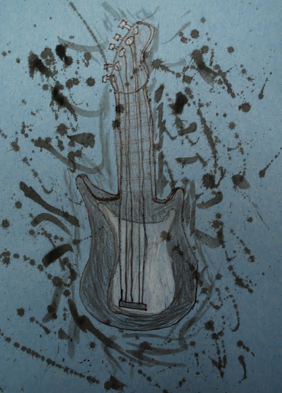
Guitar for Dad
Bouncy Ball for a cousin