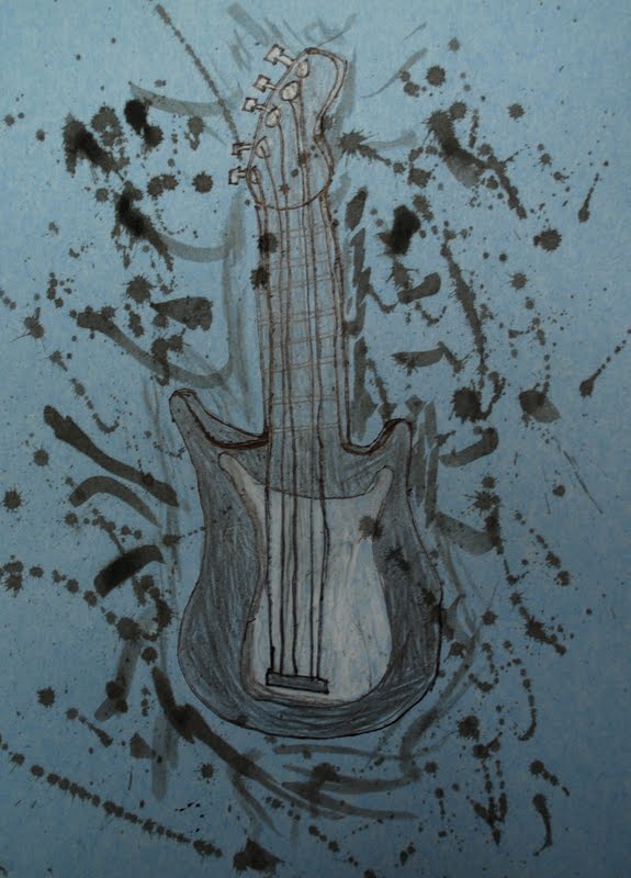
In late July I attended and presented at the TAB KC summer conference. A couple of the ideas shared were drawing with India ink in bingo daubers and making neon artwork and letting it glow under a black light. These idea were a huge hit with my 8th graders!
Disclaimer: I used Amazon Associates to link to a couple of the products we used for this lesson. If you happen to purchase the items through my link, I may earn a small commission but it does not charge you any extra.
I set out some large pieces of drawing paper and let students practice with the bingo daubers before they started on their own paper. This let them get the feel for it and approach their drawings with confidence. It doesn't work very well to have students draw it out in pencil first since the tip on the daubers is much thicker than a pencil. They have to learn to loosen up and embrace and "mistakes" that happen. The bold outline also gives it a pop art feel.
I ordered some neon supplies off of Amazon. Others were purchased from my local Walmart.
Did yo know that not all white paper will glow under a black light? If this is important to you, check your paper before students begin so they know how to plan. Some of the paper I had glowed but not all. I never figured out the difference since the paper had been removed from the packaging long before. Our white paint also did not glow.
When students thought they were done painting, they put their work under the black light as a test. I put a black lightbulb in a small lamp and placed it in the kiln room so it would get dark enough to see.
Since I couldn't figure out a way to get a black light in the hallway we settled for a printed photo of the picture glowing under a black light so viewers could see the intention.
Jim Dine is an American artist who doesn't agree with the label of Pop Artist that is often used to describe him. While Dine uses simple, recognizable imagery in his work, the images are personal. Jim Dine is probably best known for his paintings of hearts but when I was researching him a while back I found some beautiful drawings of tools and fell in love with them! I love the mark making, the quality of the lines, and the range of values.
I also like the reason Dine chose to come back to tools again and again- his family owned a hardware store when he was a child so he grew up around tools. (If you want to learn more about Jim Dine, the Art Story has a good resource.)
Here is the lesson plan I eventually came up with inspired by Jim Dine, which I posted on the smARTteacher.
10 sessions; 45 minutes per session
1. SWBAT participate in a discussion about Jim Dine's work. 2. SWBAT brainstorm people who are important to them and objects that represent them. 3. SWBAT create a 6 step value scale using drawing pencils. 4. SWBAT identify the differences between different types of drawing pencils (ex: 2B, 4H). 5. SWBAT create a symbolic observational still life graphite drawing of an object that represents someone important in their life. 6. SWBAT utilize graphite drawing techniques to create value and contrast in their drawings. 7. SWBAT reflect on their work and self-assess using a rubric and artist statement.
1. Paper (white drawing paper or I've used colored construction paper for upper elementary) 2. Variety of drawing pencils 3. Erasers 4. Objects to observe (students bring from home or find in the classroom) Optional 5. Other black and white media such as charcoal, colored pencils, etc.
Day 1 1. Introduction -Lead presentation about Jim Dine's work and discuss with students -Explain that he was identified as a pop artist but doesn't totally fit the bill since his work is more personal and about creating meaning 2. Brainstorm -Students brainstorm at least 2-3 people important in their life -Students brainstorm objects that could represent those people. Suggest thinking about the connection between them- what do they do together, what's special about them, why are they important to you, what do they enjoy, etc. Day 2 3. Drawing from observation -After students bring their objects from home they will create a line drawing from observation. -Remind students to spend at least as much time looking at the object as they do looking at their drawings -Draw light until you know it's right
Day 3 4. Creating value -Talk about value creating contrast in drawings -Demonstrate and then students create a 6 step value scale using a soft pencil and a harder pencil -Review the differences between B and H pencils -Practice blending and remind students to follow the contours when they shade. 5. Students begin to add value to their drawings after the line drawing is complete
Days 4-9 6. Students continue to work on drawings. The teacher provides assistance and feedback.
Day 10 7. When drawings are finished students will self assess with a rubric and write an artist statement about the work and the significance
I have taught this lesson to 5th and 8th graders, but I also think it would work well with high school. Last year I did it toward the beginning of the semester for 8th graders to give them kind of a warm up for observational drawing, practice shading, and to help them start thinking about the reasons artists choose their subject matter.
This student made her drawing kind of a compilation of objects within the theme. She even brought in a real saddle to draw from! We didn't think she'd be allowed to bring in one of her horses so we went with a toy. :)
These two students made drawings that represented their fathers.
I only have a few photos of student work because I had a tiny class of only 6 8th graders last year. I am planning on doing it again next year and I hope it goes just as well.
This is the same clay lesson I used with 5th grade last year. (View the original post here). We talk about Pop Art focusing on Claes Oldenburg's food sculptures. The students use handbuilding techniques to make small scale food sculptures- either just the food or food on a plate or in a bowl.
When I was researching Jim Dine for my Kindergarten Hearts lesson, I became much more interested in his drawings of tools. I love how Dine uses value and texture and how his artwork has personal meaning. I filed the idea away and saved it for the end of the year with my 5th grade students. I think this project had a lot of strong points but of course I learned things that would make it work better in the future.
Glasses/Goggles for her grandma.
On the first day, I started with a PowerPoint about Jim Dine. The students were somewhat familiar with Pop Art since they made food sculptures last fall but I pointed out that Dine was different than most Pop Artists because he had personal reasons for choosing the objects he represented. I deemed it Personal Pop Art. I passed out half-sheet planning forms to help the students plan for the project.
Click on the photo to see a larger version.
The students were supposed to think of 3 people who are really important in their lives. *I did not allow students to use a heart symbol.* I suggested leaning towards family members or role models (someone they look up to and have a real relationship with) instead of friends. I just had this fear of students choosing a friend and then destroying their artwork if they had a fight with that friend or something silly like that. This was my favorite part of this project, seeing the relationships. For each of the people the students wrote down, they were supposed to brainstorm possible objects they could use as symbols for that person. I suggested an object that was small enough to hold in their hands. The tricky part for some was coming up with an "object" for a symbol. For example, some students wrote down an activity like "dance" or "fishing" so I helped them come up with objects as symbols for those things. I briefly conferenced with each student to help them choose the best symbol and it was really cool to hear them talk about the who, what, and why.
The rest of the class was spent making a line drawing of their object on construction paper. I let them choose any color they wanted besides black and white since I explained we would ONLY be using black and white media to add value and texture to the drawings in the second class. The students had to think about what they wanted the final project to look like and consider that when choosing a color. I told them if they wanted a color besides black and white, that is the color of paper they should choose.
Fishing pole for his grandpa.
During the second class, the students added value to their objects. This is where it would have been REALLY handy to have the actual object for the students to look at. We were able to find a few things around the Art room to use (a CD, a book, a fake banana, etc.) but most just had to make it up or look at a picture I pulled up on the computer. This project showed me that I really need to focus more on value with the students. I realized that when I talked about shading before with them, it was in color. That knowledge doesn't always translate to black and white. After value was added to the objects, the students experimented with expressive mark making to add texture similar to Jim Dine's drawings. I pulled out just about all the black and white media I could find. I found sharpies, crayons, graphite sticks, and also watered down black paint so it could be used for splatters. Experimenting and using lots of media/techniques was encouraged.
5th grade students learned about Pop Artist, Claes Oldenburg, and viewed images of his food sculptures. The students had 2 class periods to make their own miniature food sculptures out of air dry clay- one to construct and one to paint. I showed the students how they could make their sculptures hollow to stretch their alloted clay further. Some made pinch pots to stick together for the main body of the sculpture, some used slabs and coils, and some just made their artwork solid. Pizza slices and hotdogs seemed to be the most popular foods at my school. I took some cool photos of students acting like they were eating their sculptures but I won't be adding them since they show the students' faces. This project was a big hit!
I like how this student made his orange not quite ripe!
 In late July I attended and presented at the TAB KC summer conference. A couple of the ideas shared were drawing with India ink in bingo daubers and making neon artwork and letting it glow under a black light. These idea were a huge hit with my 8th graders!
 I set out some large pieces of drawing paper and let students practice with the bingo daubers before they started on their own paper. This let them get the feel for it and approach their drawings with confidence. It doesn't work very well to have students draw it out in pencil first since the tip on the daubers is much thicker than a pencil. They have to learn to loosen up and embrace and "mistakes" that happen. The bold outline also gives it a pop art feel.