Showing posts with label monochromatic. Show all posts

Sunday, May 12, 2013

3rd Grade Monochromatic Paintings

 I shared a while back that Greg Percy would be visiting my schools to give two assemblies with his "Songs in the Key of Art". I will share some pictures and more about that experience soon, but first I want to share some of the lessons I tied to his songs and taught prior to his visit. 3rd grade students listened to a song about tints and shades before making monochromatic tempera paintings. Since I'm transitioning to giving the students more and more choices, the students drew whatever they wanted, knowing that they would be using tints and shades of only one color to paint. 

After the introduction on the first day and seeing lots of examples of monochromatic paintings, the students started to draw. At the beginning of the second class period, I gave a demo and showed a watercolor painting I made in high school when learning about tints and shades. I pointed out how the frog in real life was not red and neither were the leaves, that I had changed the colors and used different values to keep everything from blurring together. The students seemed like they understood and started painting. Then they totally forgot how to stay inside the lines. I showed again how to paint the outline of one shape at a time and how to differentiate between parts of the painting with different values, and most still struggled. 
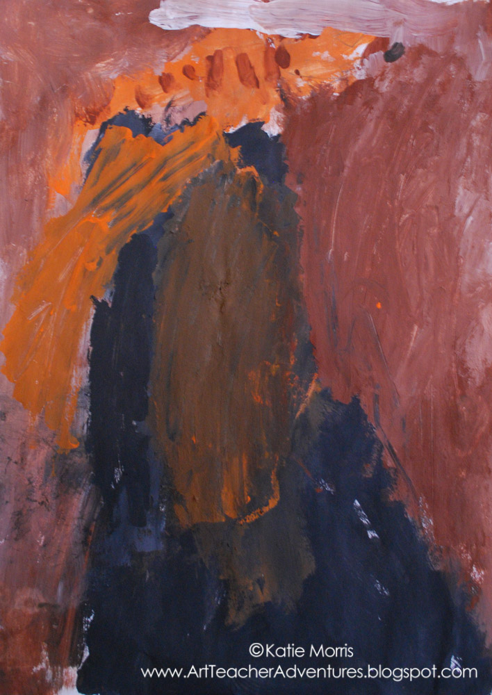
This is a "typical" example of one of my 3rd grader's monochromatic paintings. You can see an attempt to create different values but the lizard that was drawn on the tree has been totally obliterated. I was getting frustrated and questioning how I didn't know this would be too hard for most of the students. What didn't occur to my pregnant brain until after, is that yes, it may have been a bit too hard, but the students would probably have been more successful had they been given a chance to practice mixing tints and shades before starting to paint. That's the challenge- finding the balance between opportunities for expression and technical skills. I think that the students' ideas and expression are more important, but technical skills help them to better communicate those ideas. 
I grouped the students in seats by color choice to make paint distribution quicker.
Soooo, I would probably not recommend a monochromatic painting lesson for 3rd graders. However, if you happen to be planning to teach your students about tints and shades, check out Greg Percy's song! It's still stuck in my head- "to make a tint you add some white, then your color will be more light"... "when you add black you make a shade, it's true...."

Here are some of the more successful student examples:


Monday, August 1, 2011

5th Grade Personal Pop Art

Popcorn for his mom.
When I was researching Jim Dine for my Kindergarten Hearts lesson, I became much more interested in his drawings of tools.  I love how Dine uses value and texture and how his artwork has personal meaning.  I filed the idea away and saved it for the end of the year with my 5th grade students.  I think this project had a lot of strong points but of course I learned things that would make it work better in the future.

Glasses/Goggles for her grandma.
On the first day, I started with a PowerPoint about Jim Dine.  The students were somewhat familiar with Pop Art since they made food sculptures last fall but I pointed out that Dine was different than most Pop Artists because he had personal reasons for choosing the objects he represented.  I deemed it Personal Pop Art.  I passed out half-sheet planning forms to help the students plan for the project.  

Click on the photo to see a larger version.
The students were supposed to think of 3 people who are really important in their lives.  *I did not allow students to use a heart symbol.* I suggested leaning towards family members or role models (someone they look up to and have a real relationship with) instead of friends.  I just had this fear of students choosing a friend and then destroying their artwork if they had a fight with that friend or something silly like that.  This was my favorite part of this project, seeing the relationships.  For each of the people the students wrote down, they were supposed to brainstorm possible objects they could use as symbols for that person.  I suggested an object that was small enough to hold in their hands.  The tricky part for some was coming up with an "object" for a symbol.  For example, some students wrote down an activity like "dance" or "fishing" so I helped them come up with objects as symbols for those things.  I briefly conferenced with each student to help them choose the best symbol and it was really cool to hear them talk about the who, what, and why.

The rest of the class was spent making a line drawing of their object on construction paper.  I let them choose any color they wanted besides black and white since I explained we would ONLY be using black and white media to add value and texture to the drawings in the second class.  The students had to think about what they wanted the final project to look like and consider that when choosing a color.  I told them if they wanted a color besides black and white, that is the color of paper they should choose.

Fishing pole for his grandpa.
During the second class, the students added value to their objects.  This is where it would have been REALLY handy to have the actual object for the students to look at.  We were able to find a few things around the Art room to use (a CD, a book, a fake banana, etc.) but most just had to make it up or look at a picture I pulled up on the computer.  This project showed me that I really need to focus more on value with the students.  I realized that when I talked about shading before with them, it was in color.  That knowledge doesn't always translate to black and white.  After value was added to the objects, the students experimented with expressive mark making to add texture similar to Jim Dine's drawings.  I pulled out just about all the black and white media I could find.  I found sharpies, crayons, graphite sticks, and also watered down black paint so it could be used for splatters.  Experimenting and using lots of media/techniques was encouraged.

Check out some of my favorite examples below and view our exhibit on Artsonia!

Crappie for her grandpa.
Hockey stick for a RoadRunners player who he looks up to.
A bobber for a grandpa that likes to fish.
This student combined his three different ideas for his mom: a shield, a paintbrush, and a cross.
Banana for her sister "Hannah Banana"
Apple for her teacher
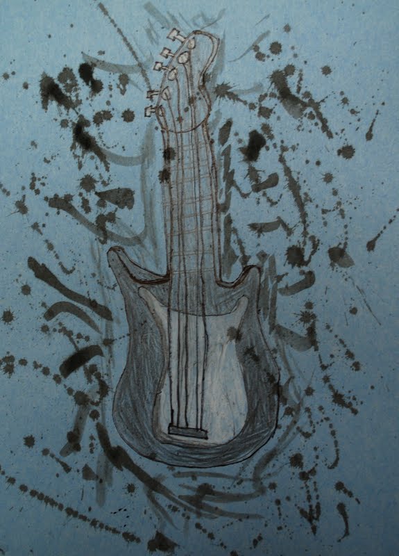
Guitar for Dad
Bouncy Ball for a cousin

Sunday, July 17, 2011

6th Grade Relief Sculptures


I love relief sculptures.  I like them personally because I am much more comfortable with two dimensional artwork and they are closer than sculptures in the round.  I like them for school because it is much easier to store 110+ projects when they are fairly flat than big bulky sculptures would be.  I made a relief sculpture totally out of cardboard for an assignment in my 3D design class in college.  If I taught older students, I would totally give the assignment for a cardboard relief sculpture.  Since I was a little leery of giving box knives to my 6th graders, we took the assemblage route.

My cardboard relief sculpture.
I had my mom save cardboard pieces for me that come in yogurt cases at Walmart.  The benefit of this is that I had a whole bunch of cardboard pieces that were already roughly the same size.  It saved me a ton of time since I didn't have to cut the cardboard down.  What did take some time, or at least some forethought, was collecting other materials.  I saved bottle caps, egg cartons, cardboard tubes, even dried up sharpies and pencils that were too small to use anymore.  I scavenged the dumpster at the cabinet shop where my dad works for small wood scraps and collected shells, pine cones, and "gum balls".  I tried to get students to bring found/recycled materials from home but none remembered so I was glad I had been saving anything small and lightweight that could be glued to cardboard. 


Regular bottled glue worked great to attach objects with a flat surface for glue.  We did have some hot glue guns set up for more irregular objects.  We had one class period to construct the sculptures so I ended up running one of the glue guns for students who were struggling to move fast enough or afraid of burning their fingers.


During the second class period, the students covered the entire surface with white tempera paint.  In the third class, the students chose a color of house paint left over from our mural last year to cover the entire surface.  I limited the students to a monochromatic color scheme to show them how color can unify a composition and to remind them of Louise Nevelson's sculptures that I showed to introduce the project.
*We probably could have skipped the white tempera paint step.  The house paint covered so well that it wasn't really necessary.


I put gallons of paint out on the front table with cups of each color in front.  The students rearranged themselves to share paint and I poured refills when needed.  This process worked pretty well and I actually don't think we had any major spills.


I learned after photographing the still-wet sculptures in the first class to remind students to make sure they drained any hidden paint.  The big round thing on the right side is the strainer lid from one of those fresh mixer pasta things- it had totally filled with paint so we were surprised when we turned it vertically!


Wednesday, March 17, 2010

Happy St.Patrick's Day!


I'm on spring break this week so I got to wear my green shirt and lime green, intended-for-Halloween, socks with spiders on them (even though I have a totally irrational fear of spiders) in the comfort of my own home.  Last Tuesday was my last day with my K-3 students before Spring Break.  A lot of them were already geared up for St.Patrick's Day so I came up with a really simple lesson for the students, basically free draw but in a green monochromatic color scheme.  We talked briefly about St.Patrick's Day and discussed that green is a symbol of the holiday.  Two of the classes were given green, white, and black gouache paint (ahead of schedule) and students in the other classes used green, black, and white crayons to make a drawing when they finished the regular assignment early.  


We were told at a staff meeting that students need at least 6-15 exposures to a new vocabulary word before the word becomes part of their vocabulary.  I had "monochromatic" written on the chalkboard with "one" written under mono and "color" written under chrome.  I'm a big fan of etymology, I think it's really interesting and has definitely helped me to expand my vocabulary and have a better understanding of new words.  I broke the word apart and had the students repeat it (even my Kindergarten students could do it!) and randomly stopped the students while they were working to ask "what was that big word again?" or "what does monochromatic mean?"  I also threw in tints and shades but I didn't spend quite as much time on those words as "monochromatic."


I told the students that they could make a picture of whatever they wanted (as long as it was school appropriate, of course) as long as they stuck to the color scheme we discussed!


Sunday, February 21, 2010

Monochromatic Silhouettes


I posted about my 6th grade Monochromatic Silhouette lesson before but now I've finally gotten ALL of the artwork photographed and on to Artsonia.  I got the artwork hung in the hallway in time for parent teacher conferences.  I hung the artwork in two groups and I actually feel a lot better about the results of the project when I saw them all together.  I limited the students' paper choices to orange, blue, green, or purple to make the painting process easier.

Check out the action painting 4th from the left on the 2nd row from the top!


Check out this exhibit on Artsonia!