Showing posts with label overlapping. Show all posts

Sunday, December 21, 2014

"Space" Drawings

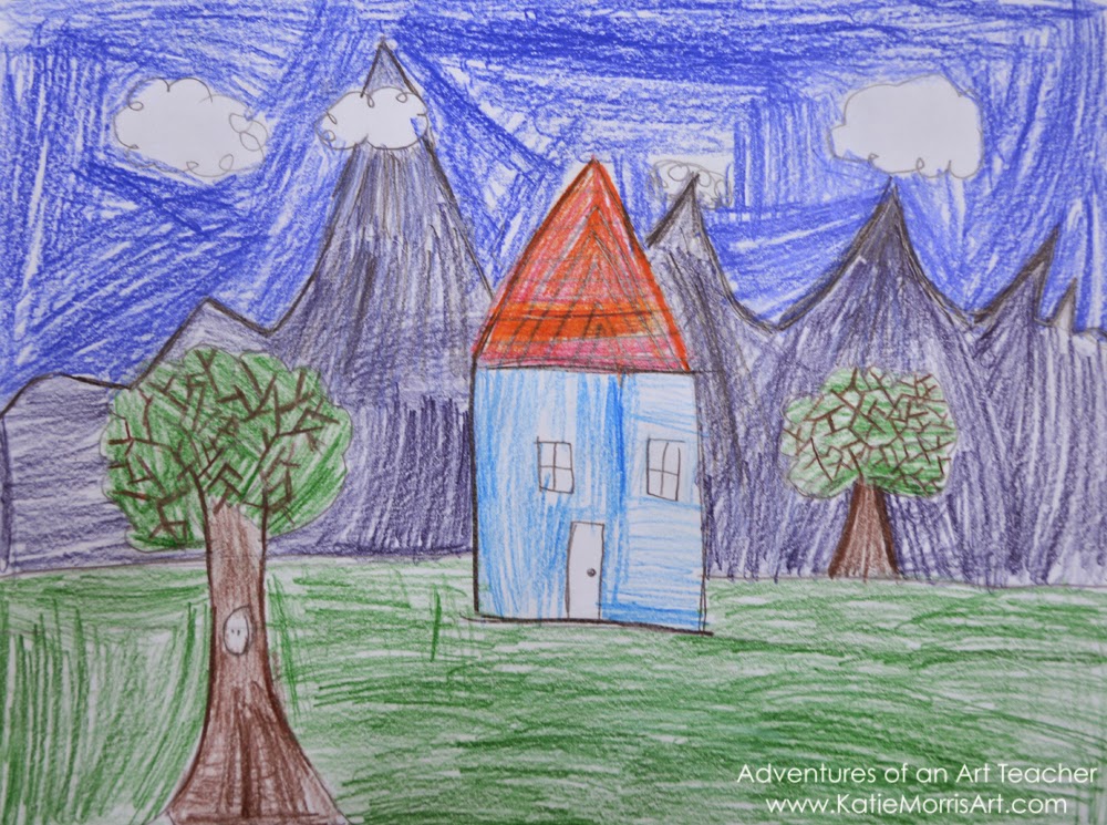
One of my goals this year was to help students understand simple ways to show space in their artwork. I had some students put their hands together and say "space" as they moved their hands apart to remind them that in art, space means distance. 
With 1st-3rd grade, we talked about layers and overlapping being simple tools for developing space, as well as making objects in the distance smaller and higher on the paper. Even just raising the horizon line a little bit above the focal point instead of having that focal point (a house, a person, etc.) on top of the line creates a bit of distance. Lots and lots of students have all of a sudden become interested in landscapes.
There have been a lot of drawings as well as some wax-resist and mixed media paintings.
It has really made a big difference in improving their compositions!

Monday, January 9, 2012

2nd and 3rd Grade Snowpeople

Here are a couple snowpeople projects my 2nd and 3rd grade students completed in December. I have to say snow"people" because you know, it's an inclusive term and doesn't leave out the lovely snowladies.

2nd grade students learned how to overlap circles and create the look of spheres by adding VALUE with oil pastels. We've been on a value/shading kick in 2nd grade. My Tuesday classes who had an extra day practiced drawing and shading spheres in graphite in the first class then finished drawing their snowpeople scenes in the second class. Some still don't quite get that the shadows would always be on the same side but at least they are starting to understand shading. I'm hoping it will help when they start working on their duck stamp drawings in a few weeks. I left this lesson last year when I was on maternity leave and I think it went pretty well this year. I wasn't super excited about it, probably because it's a lesson you see all the time, but I suppose there's a reason it's tried and true! One little boy put his snowman in a leather jacket, which was super cute, but then he colored his sky in black behind it and it sort of disappeared. We're working on contrast...


 I had intended for 3rd graders to make snowpeople prints. but we made some changes.. 
I demonstrated overlapping the circles to make them look like stacked spheres on a snowperson, both as if you were looking straight at it and as if you were looking up to give them more options, then reviewed horizon lines. The students had a lot of freedom- their only requirements were to make a snowperson with overlapping and a horizon line. Any other features and details were up to them. They drew on these dense fiber board things, I really have no idea what they were used for but they are awesome, then traced with glue. *Of course when you trace a drawing with glue, you have to remind the students not to draw anything too small and to leave space between things so the glue lines don't run together or turn into big blobs. This started as another lesson I left during maternity leave.
 Last year the students used rainbow crayons made from recycled crayon stubs to rub over paper and make their drawings show through. I thought it would work to print the glue lines but when I tested mine, the glue was so bumpy that it was hard to make out the picture. I knew the students' lines were even bumpier so we changed the plan. I used it as an opportunity to talk to the students about problem solving and things not always going how we plan. I wanted to show them that even though my first idea didn't work very well, I didn't give up, just came up with something that would work better.
I haven't decided if covering the tables with vinyl cloths save time or not when cleaning up from painting...
In the second class period, I gave each table the primary colors, white, and just a tiny bit of black tempera paint to use. *It's amazing how many students will tell me I forgot green paint, for example, immediately after we review mixing primary colors to make the other colors they need! I showed them how they could use blue to add some shading (VALUE!) to their snowpeople. They were excited about making tints just like in their Polar Bear paintings. I gave them two brush sizes to use and suggested that they use the tiny brush to paint over the glue outlines of really important things. I actually don't mind the effect of the super-cheap-tempera-paint-I-wish-I-wouldn't-have-ordered here. It acted as almost a glaze and looked pretty cool with the glue showing through for snowflakes.
No fashionable snowlady would be seen in public without her makeup and best jewelry.
Students who missed the glue day drew with crayon then painted.


Thursday, November 18, 2010

3rd Grade Leaf Designs


Last year I did basically the same lesson with m 3rd grade students but had them use just two colors.  It created kind of an Op Art effect but confused the majority of my 3rd graders.  This year I wanted to keep some of the elements- overlapping to create positive and negative space and interesting shapes, and creating interesting compositions by filling the entire space.


I collected lots and lots of leaves to bring in for this project.  I also had projects using leaves planned for two other grades at the same time so the leaves were used several times.  I tried to find a variety of leaf shapes and sizes for the students to use.  I think I had one student in almost every class ask if the leaves were poisonous.... yes, my secret plan is to poison my students with leaves in Art class.  Anyway, the first class period was spent tracing leaves with pencil so that there was lots of overlapping and the space was filled.  Some students had time to start tracing their pencil lines with sharpie in the first class, the others traced in the second class.

 At the beginning of the second class, I showed the students how to trace the outline of the shape carefully before coloring in the middle.  If the students actually use that tip, they do a much nicer job getting things filled in to be nice and solid.  I showed examples from last year in our Artsonia gallery and told the students they could do the Op Art thing with two colors or use whatever colors they wanted- the only guideline with color was that no two shapes that touched could be the same color.  I found that I had to reiterate again and again that everywhere the leaves overlapped created a new shape.  Some still focused on each leaf as the shape and not the smaller sections.  Only a few students wanted to try the two color route, most used several colors.  I thought it was interesting to see the color combinations they came up with.  Some planned it out ahead of time, some would just choose one color at a time and probably used every marker color available.  Anyway, the projects were a big hit and got lots of positive comments when displayed in the hallway and I think I'll teach it again next year!


Sunday, October 11, 2009

Overlapping Pumpkins


Kindergarten students learned how to make objects in drawings overlap to create depth. I drew two pumpkins and cut them out so they could be moved to show students the visual difference between drawings of objects that are side to side and overlapping. Overlapping is kind of a difficult concept for Kindergarten students! The drawings turned out really good and it was fun to see the students get excited when it clicked. Some drew 4 or 5 overlapping pumpkins! I showed them how I blended crayon colors on my example but I let them use any colors they wanted. Who says pumpkins have to be orange?