Showing posts with label color. Show all posts

Monday, June 25, 2018

Movie Poster Design

Usually summer break is when I can get caught up on blog posts from the previous school year but this summer has been a little different! We recently moved to a new house in the country with a bigger lot that will allow for the creation of an even bigger butterfly garden, space to grow some vegetables, lots of room to play outside, AND it has a building that was previously a potter's studio! Eventually, when we get all the boxes unpacked, that space will become my studio and will have room to host workshops and teach classes. We just got internet hooked up a few days ago and on top of moving, remodeling, unpacking, etc., I'm due with our 3rd baby, like 2 days ago.

So, without further ado, here is a lesson that I've used the last 2 years in my high school computer graphics class. 2 years ago, I had a student enrolled in the class who was planning to major in film at university and would talk about the scripts he'd written. I started thinking about how cool it would be to make a life size movie poster for one of his films, as well as how many of our CTE competencies could be hit with a movie poster design project. Movie posters have emphasis and heirarchy, they give you hints at the story without giving away EVERYTHING, and they use color as a design element. 

I first asked students to come up with a movie concept- this could pretty much be anything appropriate for school. Some did parodies or mash ups, some did spin offs of series they enjoyed, and some made completely new ideas. The students filled out a simple google form with questions about genre, a short synopsis, etc. just to help them think it through.

After planning the idea, the students created thumbnail sketches to help plan the composition. They were supposed to create 3 sketches and get feedback from classmates on which was the most effective.

Next, we watched a short video on how color is an important storytelling element in films. The students were asked to choose a screenshot or poster from a movie, tv show, or video game in the same genre as the poster they were planning and sample the colors. I later showed how they could use the hue and saturation and color balance tools in photoshop to adjust the colors of the photos they were using.


The students then gathered images- either creating their own (preferred method) or using images labeled for reuse. We had digital cameras, scanners, graphics tablets, and our software available for use. The posters were designed to either 24x36 inches or 16x20 inches. Our school has a large poster printer so it was really fun to print the poster from the furture film-creator student at 24x36 inches and display it at League Art. He was a student who didnt' see himself as an artist so it's always extra fun to see a look of satisfaction on a "non-artist's" face when they are proud of their work.

 I recently posted the lesson plan with links to the plan document, rubric, etc. on the smARTteacher so feel free to head over there and check it out!

Friday, August 25, 2017

Collaborative Color Wheel

I wanted to start off the year with some low pressure collaborative activities in my high school classes. One of the activities was a refresher or introduction to the color wheel. I went over the basic primary and secondary colors and told them that intermediate colors go in between. 
Students working on organizing colors on the collaborative color wheel.
I asked the students to cut swatches of color from magazines to organize onto a color wheel. I had a big circle cut out of mat board for the base which was donated last year but you could use cardboard, poster board, or any big piece of paper.
After the students had cut some swatches to start with we talked about organizing colors. I suggested they put the "true" colors in the middle of each wedge and the colors veering toward intermediates closer to the other combining color. The students decided to put the lighter values in the middle and the shades toward the outside.
Finished color wheel.
Positive take-aways were students analyzing the colors and starting to understand the variety that is out there beyond basic colors. Hopefully when we get to our painting boot camp next month and mix colors they will remember and be inspired. Plus, we now have a big, custom color wheel for reference! 
The students also had time to start some smaller value scales, which are pretty fun. I'm looking forward to getting them put up in the classroom.

Thursday, June 5, 2014

Experiment Paintings

This spring I thought it would be fun to loosen up and do some "experiment paintings" with my 5th and 6th grade students. They're naturally in the stages of artistic development where children become critical of their work and can get very hung up on things looking realistic. We went a totally different direction with some non-objective paintings. Almost every student tried out this style of painting by the end of the school year.
We could've gone old school to learn about non-objective painting with some nonobjective paintings from Art History (de Kooning, Pollock, Kandinsky, Rothko, etc.) but since they were really starting to get squirrely at that point in the school year, I decided to show a video that Alisa Burke put together on some everyday objects she likes to use in her paintings. You can see the video here: http://alisaburke.blogspot.com/2013/11/my-favorite-everyday-things-for-painting.html
 At the conclusion of the video, I asked students to name tools they noticed. After the students listed what they had noticed from the video, I showed what unusual tools we had in the art room- bubble wrap, tubes for stamping, tin cans, foam brushes for stamping, brayers, etc. 
 I filled egg cartons with tempera paint but suggested that students not try to use EVERY color. We talked about the color wheel- which colors might blend nicely together and which would likely result in mud. I did a demo and showed how to "dip the tip" of the brush into the paint and how I could switch colors without water by trying to use all the paint on my brush first, and then not stirring the new color. I think if the students had used water, the paintings would not be as vibrant. I set out all of our tools on a table and the students just picked what they wanted to use.
 I told the students these were "experiment paintings" for a reason- I wanted them to explore the qualities of the paint, try out different color combinations, textures, etc. without being afraid of making a mistake. The end result was a lot of awesome paintings. Some looked like finished pieces, while other needed more attention in later classes. 
 One way to use the painted papers is to add solid colored strips for a paper weaving project.
 Other uses for the papers are
  • drawing on top of the painted paper
  • painting on top of it
  • collage- background
  • collage- cut it apart and glue onto something else
  • journaling on top

Next year I may do this before opening up the collage center. I'm thinking about getting rid of my magazine stash as the students K-6 relied too heavily on magazine images instead of making their own. I think it may be helpful to show the students how to make their own papers first.

Monday, December 30, 2013

Sacred Dogs

“Suddenly the sky was filled with Sacred Dogs of all colors and the boy could never count their number. Their galloping was like the wind and the drumming of their hoofbeats shook the hilltop on which he stood.”
-The Gift of the Sacred Dog by Paul Goble
During our Native American cultures focus for Cultural Heritage Week, Kindergarten students listened to "The Gift of the Sacred Dog" by Paul Goble, which tells the legend of how horses came to be with the Plains Indians. We tried out some really basic text methods from one of our Common Core PD sessions (making predictions, backing up answers with the text) and when our story was finished, we looked at a really cool painting by Crow artist, Kevin Red Star called Kingfisher's Spirit Ponies. Red Star's painting helped us see the kinds of lines and shapes used to make horses, and how the artist made his horses colorful, just like the sacred dogs in the book. 

After the discussion, I did a quick demo showing how to make a horse with simple shapes, but did not direct the students' drawings. This meant that lots of the "sacred dogs" looked more like dogs than horses, but I'm ok with that. It was the first drawing assignment my Kinders had so it helped me see how they see things, and what I could focus on to help them.
The students chose a piece of construction paper to draw from (I pulled out a "multicultural" pack so they had a variety of tans and browns to choose from), and after they drew in pencil and traced with sharpie, construction paper crayons were used to add color. The students chose the composition, number, size, and color(s) of their horses, as well as if the background would be a realistic setting or a colorful, stylized setting. These horses sure do have personality!

Sunday, February 12, 2012

Another Jim Dine post


Source: artnet.com via Katie on Pinterest

I wanted to do a Jim Dine-inspired lesson with Kindergarten to help them get [even more] excited for Hoops for Heart and at first, I planned to do something similar to the lesson I tried out last year. The students noticed the texture in the background of some of Dine's heart paintings, "scribbled" with cool colors on cool colored paper, learned to make a symmetrical heart by cutting folded paper, then used the cut out as a stencil to brush a red heart over the background.
Last year's Dine project
Then I saw a post from Rust and Sunshine about making heart stamps out of cardboard tubes, and since I knew the students would have so much fun with it, I tweaked my plan.  http://rustsunshine.blogspot.com/2012/01/heart-stamps.html

This was completed in one, 40-minute class period. First we looked at and discussed Dine's painting shown at the top of this post. I asked the students to just look and think for a minute, without saying anything before talking. Then I asked "What do you see?" and the students raised their hands to name things. The first thing mentioned was, of course, "hearts". I was trying to get them to say the word "shape" when I asked "what are hearts?" and "what do hearts have in common with circles, squares, ellipses, triangles, and rectangles?" I finally gave up after I got answers of "square!" and "circle!" and told them that they are all shapes! We took a minute to discuss if the hearts on the projector screen look like the real hearts in our bodies (the students were split on this but I convinced them they are a little different) and what we can do to have healthy hearts.

Then the students pointed out the different colors and we talked about how some of the sections looks like they have texture. After demonstrating some crayon techniques to achieve different textures, the students used crayons to fill in their 8x10 inch paper with colors and textures. When they were done with the background, I showed them how to use the cardboard tubes turned heart stamps by gently pressing them into the paint and then stamping on their paper. I made about 30 stamps and that was enough to get through my 6 Kindergarten classes. Some stamps were in pretty bad shape by the end from students banging them onto their papers, but the other end of the stamp was usually usable.

*If you make cardboard heart stamps, definitely use a good piece of tape to make the folded tubes hold their shape, like is suggested at Rust and Sunshine where the idea came from.


Tuesday, January 24, 2012

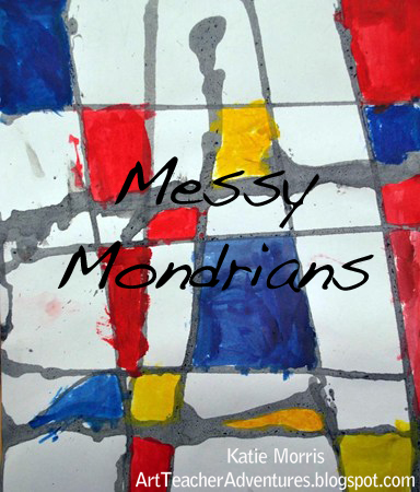
Messy Mondrians

Kindergarten at my school, as I'm sure they do in many schools, studies a letter a week. A couple months ago for "M" week, I wanted to do an Art lesson that incorporated the letter. At first I had "magenta monkeys" in my head but I never came up with a lesson I was excited about. Then one day I had some extra liquid paint from a lesson with paint droppers and not wanting to waste the paint, I decided to play! I came up with an idea that I really like: Messy Mondrians.

Most classes used paint droppers* to drip horizontal and vertical lines of black paint across their papers in the first class, after the Mondrian introduction and discussion, of course. In the second class, they were given only the primary colored tempera cakes to paint in their shapes.  A few classes used cardboard to stamp horizontal or vertical lines and colored with primary colored crayons. I prefer the dripped artwork over the stamped but uneven scheduling with two classes, and students who were too chatty in another, meant changes were necessary. I wish I would have checked the diluted paint for the droppers more carefully because I added a little too much water and it ended up gray instead of a rich black..
*Some people might think I'm a little crazy for giving Kinders paint droppers. For the most part it was fine. I did have one little mishap. As I was describing how you only need to squeeze a little bit of paint at a time on the edge of your paper and let it drip to the other side, I was holding a dropper full of paint in the air in front of me, and a little boy who can't always control his impulses shot his hand out and squeezed the dropper, splattering black paint all over the table and one little girl's paper. He immediately said "Sorry!" but I was stubborn and didn't let him use his dropper independently since he had shown poor judgment. At first he was upset but I went on helping other students and told him when he was calmed down, I would help him. He came to get me a few minutes later and I had him direct me as I dripped paint exactly where he pointed for one side of the paper, then I held the dropper with him and let him squeeze the paint on the other.

The last 2 years I've done a collage Mondrian lesson with Kindergarten. The students took some of the elements of Mondrian's artwork (primary colored squares and rectangles and black "lines") and arranged them in their own composition. I think I was getting a little bored with it and wanted to try something different. (I just saw a mixed media Mondrian lesson on Artopotamus that was pretty cool!)