Showing posts with label photoshop. Show all posts

Friday, December 17, 2021

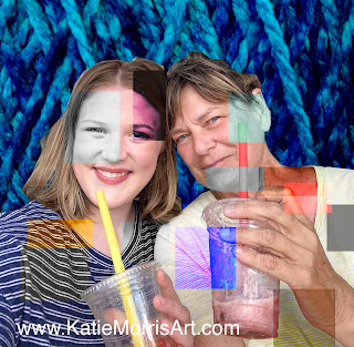
Altered Digital Compositions with Textiles

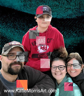
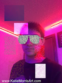
I usually like to do a quick project with my graphic design kids to have them explore filters and effects within photoshop. Last year I was excited to discover artist Prince Eric Nichols (https://www.princeericnichols.com/) and his work made from digital textiles. The textiles usually relate to the subject he is representing and I started to think about how students could do both the technical process of overlaying textiles with layer masks and work with the idea of choosing textiles that could represent their own cultures and interests.

Here is the handout I posted for students: 
https://docs.google.com/document/d/1JIFjV8slFuVaFlCjle9PxdJTEgluWX45sH3RAna48Cs/view
This took 2 class periods for my students but it could definitely be done in one if your students have more experience. Next time I will more strongly encourage students to bring textiles or photos of textiles from home instead of using what was in the art room, though I'm thankful we found quite a few options in the classroom that would work.


Thursday, March 4, 2021

Digital Snow Globes

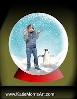
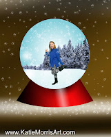
In December right before winter break my intro graphic design students "Photoshopped" themselves into a snow globe. We were able to review some of the basic skills we had already covered and introduce a few new skills. This project was fun to do and got a lot of nice comments when they were on display!


I posted the full demonstration on YouTube- you can watch the playlist here! https://youtube.com/playlist?list=PLkaa-S6cQns_fqbVhmsF14l3Y5ztRYOD_

My example
Students were able to choose what to include inside their snow globes.


Snow globes don't have to be snowy. This student chose a beach theme.

Someone suggested adding a fisheye effect- I didn't think of that in time so I will have to test that idea next year!


Monday, May 11, 2020

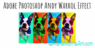
Photoshop Warhol Effect

I had planned to do one more digital project for my high school graphic design class after spring break and thought an Andy Warhol-style project would work well for the planned theme of "Multiplicity". Well.... Covid-19 threw a wrench in those plans. 
My students are 1:1 with laptops that all have some version of Adobe Photoshop or Photoshop Elements on them. I thought with my step by step tutorial complete with screenshots and shortcuts it would be no problem! I was wrong, but we still got through. Some students had major issues with their photoshop so we found that www.photopea.com works well for a web-based program. There are really only a few minor differences between photopea and photoshop. Some students just didn't want to or know how to problem solve so I had a couple share their screens with me and I helped them step by step. 
I ended up saying that even if they only got one version done instead of 4, that was ok. I really wanted them to learn to use blend modes and understand changing colors and I think we at least achieved that much!
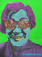
My tutorial is HERE- feel free to use with your students if it is helpful! If you want to make any changes just go to file, make a copy, and it will give you a version you can change.
My tutorial was inspired by https://www.deke.com/content/how-to-create-dekes-new-improved-andy-warhol-effect-in-photoshop with changes to work better for my students.

Adobe Photoshop Andy Warhol Effect


*Some of you will not have the same version of photoshop but you should still be able to accomplish this task, even if your tools look a little different.
1. Open your chosen image in Photoshop. Photos with simple backgrounds work the best.
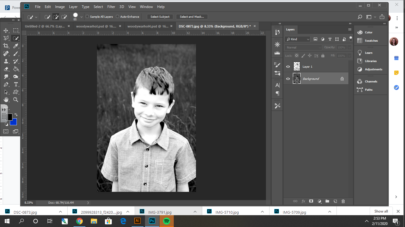
2. Use the quick selection tool (w) to select your focal point. Ctrl +C to Copy then Shift+Ctrl+V to paste in place.

3.
Turn the image to black and white. Go to Image > Adjustments > Black and White. Adjust the levels to make sure you have a good amount of contrast. Try 40 for the shadows, 2 for the midtones, and 160 for the highlights, but adjust to work for YOUR photo.
4.
Turn the background image black and white. Go to Image > Adjustments > Black and White. If you need to simplify the background, blur it (Filters > Blur > Gaussian Blur) and/or make it very dark or very light by adjusting the levels.

5.
Open the image of canvas texture. Drag and drop it into your document over the top of the photo.
Ctrl+T to resize and stretch the canvas so that it covers the entire document. Apply the transformation.
6.
Click on the canvas layer and change the blend mode on the layers panel from normal to overlay. This will let the texture show through so it looks like it is on canvas. 
7.
Create and label a layer for each feature- in this example I will create a layer for skin, shirt, mouth, eyes, and hair.
On each labeled layer use the paintbrush tool (B) with hardness turned all the way to 100%. Select a color and paint the feature.
8.
Shift select each of the painted layers. Click the 3 horizontal lines at the top right of the layers panel and select new group from layers.
9.
Drag the group behind the figure. Change the blend mode from normal to multiply. 
10.
Select your background layer. Pull up the Hue & Saturation menu (Ctrl+U) and click colorize. Adjust the bars until you like the color of the background.
11.
Save your image as a PSD and as a JPEG.
Use the paint bucket tool or Hue and Saturation to change all the colors on your image and save as a JPEG. Repeat until you have 4 separate files with different color combinations. I named mine Warhol1, Warhol2, Warhol3, and Warhol4.
12.
Create a new document that is big enough to fit 4 copies of your image in it, either in a row or 2x2. Open each JPEG you saved then drag and drop them one at a time into the new document. Use Ctrl+T to resize as necessary.
13.
Save your completed document as yournameWarhol.jpeg. 
Example: MrsMorrisWarhol.jpeg and turn it in on Google Classroom. If you turn in a PSD the file will be really big and take a long time to upload and download, plus you will not get full credit.

Tuesday, January 21, 2020

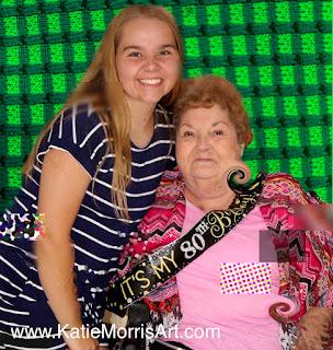
Digital Repeating Patterns


Here's a fun project my computer graphics students completed! I learned the basic steps from a Skillshare class that was hand drawn repeating patterns. I let the students start drawing by hand but we finished on the computer. Here is a link to the handout I gave them with all the steps: https://docs.google.com/document/d/1ChKRWFiFgo_rDOi1lhNMWZF8jWc1EAj8FEBXxgwHSIo/edit?usp=sharing 
 
I need to explore doing this project in Illustrator. I have only had access to an updated version of the software for about a year and am self taught so I'm not sure of the best way to do it, but I feel like it might work even better, or at least save some steps!
It was really fun to see what objects the students chose to work with.

I will admit that sometimes things don't match up perfectly when you repeat the tile, which doesn't make sense to me, but be prepared in case it happens. We were able to just make some small adjustments when zoomed in and complete a couple lines to fix things.

Saturday, December 21, 2019

Photoshop Drawings Into Reality

If you're like me, you stop and look at EVERY picture in the collection when you see something like "Dad turns his 6-year old son's drawings into reality" pop up in your news feed. I started thinking that it could turn into an interesting assignment for my computer graphics class!
I started by asking the students to draw an animal from memory- NO LOOKING at a photograph. Next, I explained to the students that I wanted them to use Photoshop to make a picture of the real animal look like their drawing. 
Some needed to combine multiple parts of different photos to match their drawing and some were able to make changes with the liquify tool, clone stamp, or selecting and rearranging parts.
Here is my example including the (not very accurate) first drawing!
Some kept the background simple, some needed to replace it with a new photo to complete the scene.
I think this lesson will be a keeper for next year. It was fun for the students to do, they had to make appropriate choices from their arsenal of tools, and it only took a few class periods to complete.

Monday, April 2, 2018

Digital Op Art

I can't believe I haven't posted this project before! I tried it for the first time with my Computer Graphics class this year and it was a keeper. We covered art history, graphic design, and practiced some new skills in photoshop.
When I show the first slide without the Op Art title, I ask the students if they know what that style of artwork is called or if it reminds them of anything to gauge their prior knowledge. We talk about the "mother" and "father" of Op Art and what we can learn to apply to graphic design.


Next, I demonstrate some techniques in photoshop that the students can try out but ultimately they choose what style of Op Art they want to use. We talk about color combinations, grid/ruler tools, gradient tools, distortion filters, etc.
The technique that the most students want to use is to put text into their Op Art. I recorded a quick video this afternoon of the steps we use. I obviously need to practice screen recording since I flubbed the beginning and end, but at least it will be handy to direct students to that video when they've forgotten a step!


Here are some of the student examples!