
This unit was super fun and one that I would definitely do again! This spring I needed to structure my middle school classes a lot differently due to seeing the students every other day so I was basically coming up with all new lessons. I found out that they were going to be doing a weather unit in science and after a workshop on data visualization at the Virtual NAEA Convention it all came together!
We started by watching the Art Made of Storms TED Talk by artist Nathalie Miebach and discussed how she turned different points of data into visual elements. The students brainstormed and selected two different pieces of weather-related data they could collect based on their observations of our weather over the month of April. I gave them a few minutes at the beginning of each class to track their data.
In May, the students explored more artists whose work visualizes data and came up with a plan for a work of art. Their artwork was only limited to available materials in the classroom or from home. It was really fun to see all the different solutions
 |
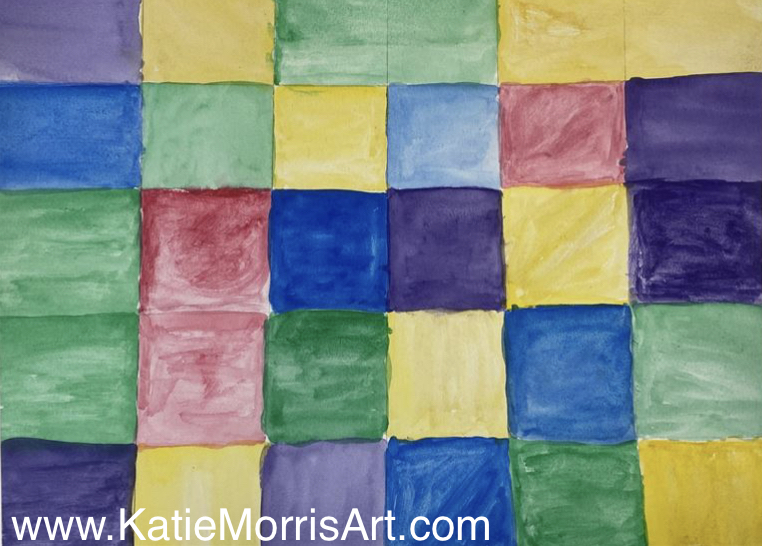
| This student tracked the temperature and her mood |
then made the piece below.


 |
| This student used the transparency of the paint to express one of her data points. |


 |
| The color of each ring on the shirt represents the temperature range. |


No comments:
Post a Comment