 |
| Popcorn for his mom. |
When I was researching Jim Dine for my
Kindergarten Hearts lesson, I became much more interested in his drawings of tools. I love how Dine uses value and texture and how his artwork has personal meaning. I filed the idea away and saved it for the end of the year with my 5th grade students. I think this project had a lot of strong points but of course I learned things that would make it work better in the future.
 |
| Glasses/Goggles for her grandma. |
On the first day, I started with a PowerPoint about Jim Dine. The students were somewhat familiar with Pop Art since they made
food sculptures last fall but I pointed out that Dine was different than most Pop Artists because he had personal reasons for choosing the objects he represented. I deemed it Personal Pop Art. I passed out half-sheet planning forms to help the students plan for the project.
 |
| Click on the photo to see a larger version. |
The students were supposed to think of 3 people who are really important in their lives. *I did not allow students to use a heart symbol.* I suggested leaning towards family members or role models (someone they look up to and have a real relationship with) instead of friends. I just had this fear of students choosing a friend and then destroying their artwork if they had a fight with that friend or something silly like that. This was my favorite part of this project, seeing the relationships. For each of the people the students wrote down, they were supposed to brainstorm possible objects they could use as symbols for that person. I suggested an object that was small enough to hold in their hands. The tricky part for some was coming up with an "object" for a symbol. For example, some students wrote down an activity like "dance" or "fishing" so I helped them come up with objects as symbols for those things. I briefly conferenced with each student to help them choose the best symbol and it was really cool to hear them talk about the who, what, and why.
The rest of the class was spent making a line drawing of their object on construction paper. I let them choose any color they wanted besides black and white since I explained we would ONLY be using black and white media to add value and texture to the drawings in the second class. The students had to think about what they wanted the final project to look like and consider that when choosing a color. I told them if they wanted a color besides black and white, that is the color of paper they should choose.
 |
| Fishing pole for his grandpa. |
During the second class, the students added value to their objects. This is where it would have been REALLY handy to have the actual object for the students to look at. We were able to find a few things around the Art room to use (a CD, a book, a fake banana, etc.) but most just had to make it up or look at a picture I pulled up on the computer. This project showed me that I really need to focus more on value with the students. I realized that when I talked about shading before with them, it was in color. That knowledge doesn't always translate to black and white. After value was added to the objects, the students experimented with expressive mark making to add texture similar to Jim Dine's drawings. I pulled out just about all the black and white media I could find. I found sharpies, crayons, graphite sticks, and also watered down black paint so it could be used for splatters. Experimenting and using lots of media/techniques was encouraged.
 |
| Crappie for her grandpa. |
 |
| Hockey stick for a RoadRunners player who he looks up to. |
 |
| A bobber for a grandpa that likes to fish. |
 |
| This student combined his three different ideas for his mom: a shield, a paintbrush, and a cross. |
 |
| Banana for her sister "Hannah Banana" |
 |
| Apple for her teacher |
 |
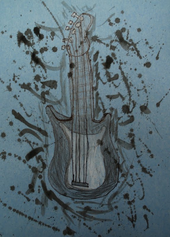
| Guitar for Dad |
 |
| Bouncy Ball for a cousin |


yay- love this! thanks for sharing
ReplyDelete